Using motion to tell the story
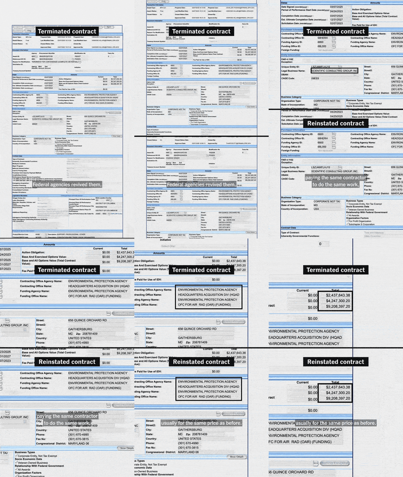
Animation bridged the gap between a boring spreadsheet and compelling insights. Instead of just showing a static table, I used motion to mimic a reporter reading the data. The scan; fast, blurred scrolling to show the sheer volume of data. The lock on; a sharp snap and a green highlight when we found an error. The breakdown; pulling a single number out of a row and expanding it so the viewer could see exactly where the math went wrong.
Breakdown of the design
For this series, our goal was to clarify the findings through the video format. Making accounting errors engaging without losing the gravity of the reporting.
We went with a bold green as the primary color. A functional choice to signal money on the go. The green acts as a highlighter, drawing the viewer to the next smoking gun. The layout is intentionally sparse so as not to compete with the facts.
We went with a bold green as the primary color. A functional choice to signal money on the go. The green acts as a highlighter, drawing the viewer to the next smoking gun. The layout is intentionally sparse so as not to compete with the facts.


